Enhancing the User Journey on the Discount Tire website

Background
Alongside two other IBM designers, I helped the AB Testing team create design solutions that aim to increase site conversion and revenue growth for Discount Tire.
Project duration
October 2022 - February 2024
Client
Discount Tire
Overview
Discount Tire is a leading tire retailer in the United States, offering a variety of tires and wheels with both online shopping and in-store installation services.
The goal is to improve the Checkout process and thus decrease cart abandonment and increase revenue for Discount Tire.
Role: UX Designer
For this A/B test, I was responsible for conducting market analysis to gather insights, design solutions based on data and best practices, and present designs to stakeholders for feedback. I worked closely with a team of UX Designers, Researchers, and Developers to guide my design decisions.
The problem
The current order summary during checkout requires too much scrolling as the user must fill out their information on the left-hand side.
As a result, the user gets lost while scrolling to fill out their information, appointment, and payment details.
The solution
Ensure the order summary is sticky on the page as users scroll through the information, appointment, and payment steps.
Initial research and analysis
Our UX design team started by conducting comprehensive user research and data analysis to understand customer needs and identify pain points in Discount Tire’s checkout process. What was observed was increased time on task and a high cart abandonment rate due to the current checkout process. From those insights, we came to a solution based on metrics and user feedback. From there, we worked closely with stakeholders to establish clear requirements which helped guide our design decisions.
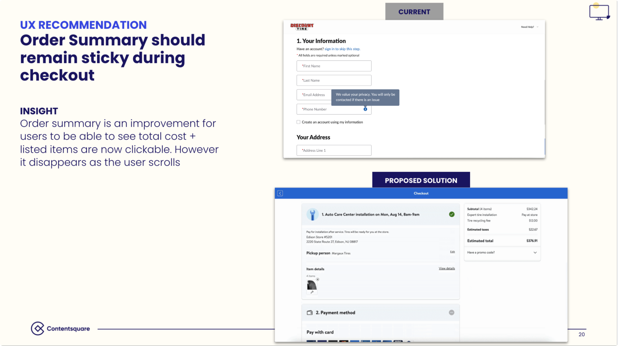
What exists today
Overcrowded Order Summary
The current order summary during checkout requires too much scrolling as the user must fill out the information on the left-hand side. As a result, gets lost as the user scrolls to fill out their contact details, appointment, and payment information.

Lengthy Customer Information section
Along with the information sections for customers to fill out to complete their orders, there is an overwhelming amount of white space to the right of the screen.
From a design standpoint, having so much white space is inefficient. It makes the page look incomplete/sparse, disengaging, and visually unappealing.

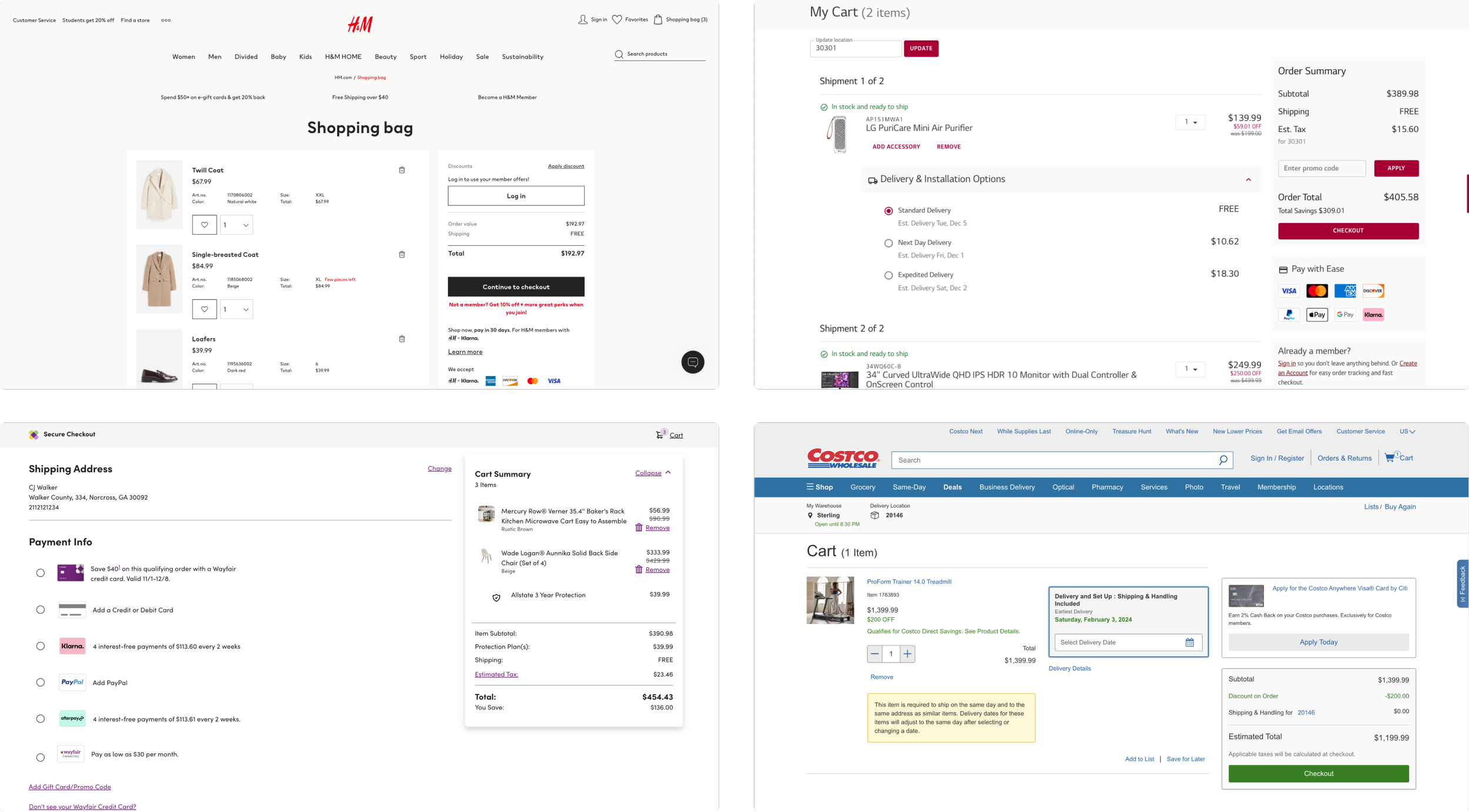
To better understand how other companies use two-column checkouts, I explored various companies, including one Discount Tire competitor (Goodyear), to identify best practices and other potential gaps in Discount Tire’s checkout design. I conducted this in addition to the previous research done by the User Researchers on the team, which provided directed based on data and industry standards.
Market analysis
Key findings
A clear, step-by-step checkout process that doesn’t overwhelm customers and provides intuitive navigation
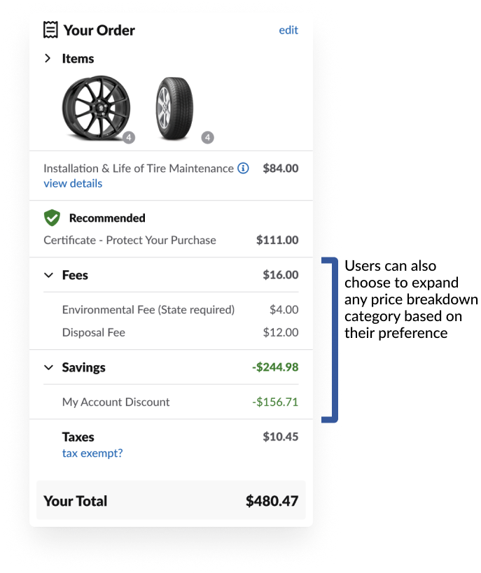
The order summary on the right has price breakdowns that customers can expand or collapse based on their personal preference
The order summary displays the products in a compact format that customers have in their carts

Through my analysis, I identified similar checkout design patterns used by well-known companies such as H&M, LG, Wayfair, and Costco.
This insight informed my design decisions related to features, functionalities, and aesthetics, and allowed me to pinpoint gaps in Discount Tire's checkout process.
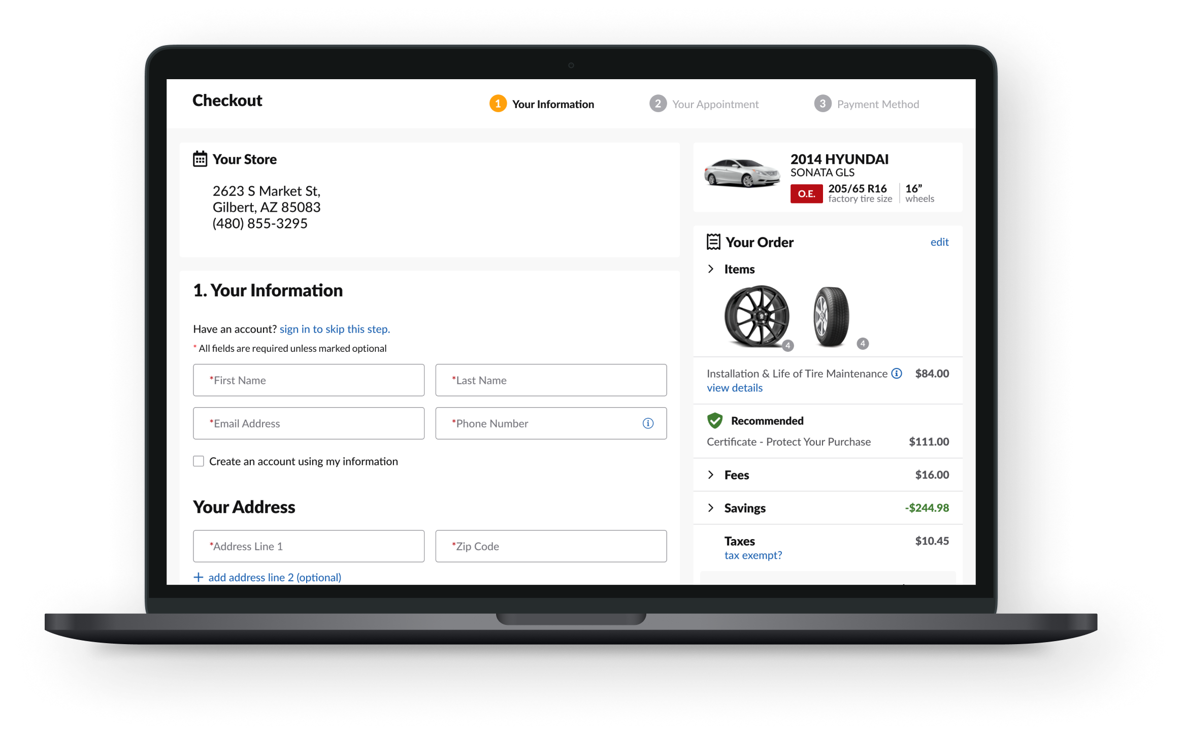
Final design
Comparisons
Through multiple iterations and refinements, our design team created high-fidelity mockups that balanced creativity with functionality, ensuring a seamless and intuitive user experience. The final design aimed to enhance user satisfaction and streamline the checkout process. Below is a comparison of the current state and the proposed design.
A Variant
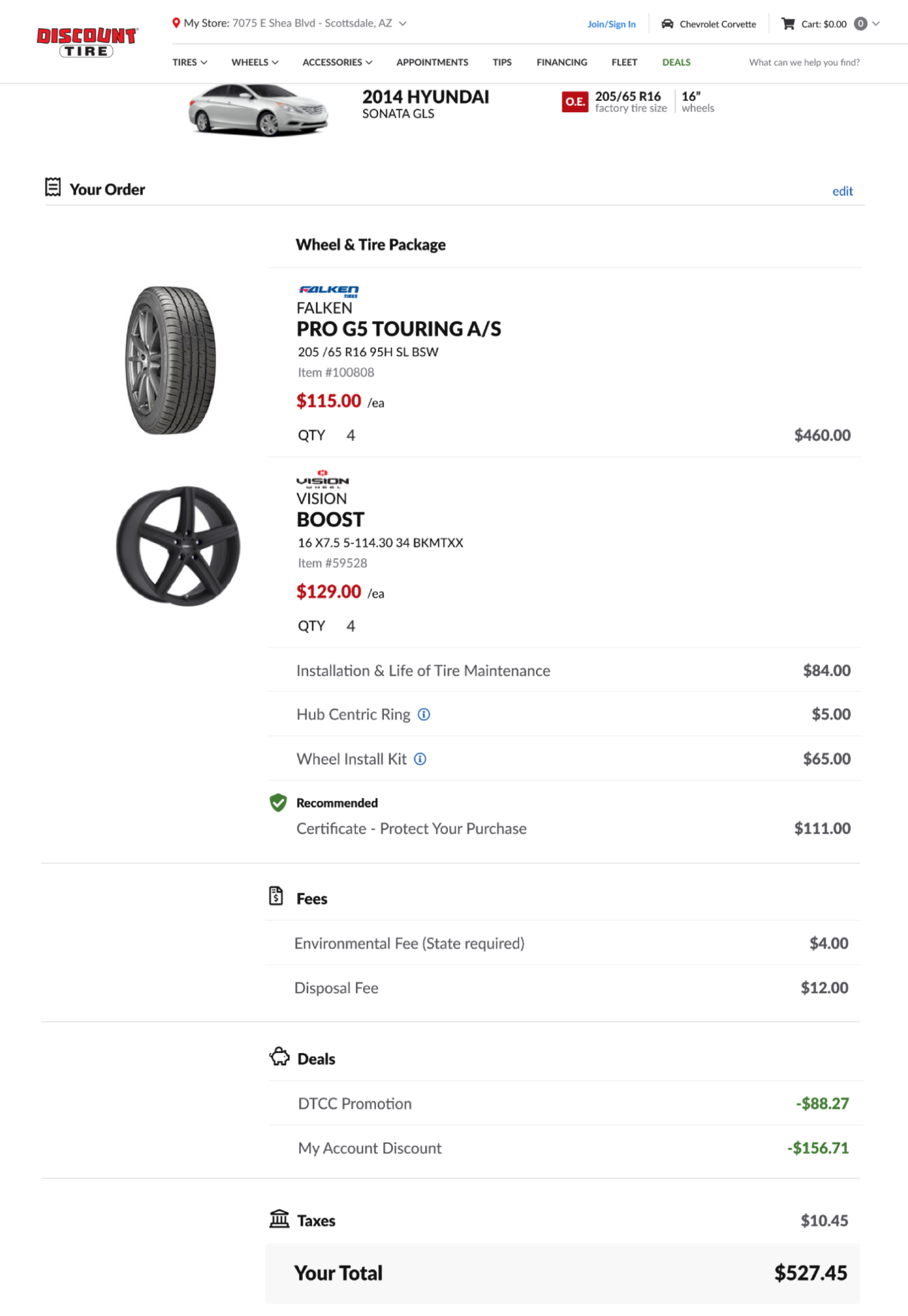
B Variant
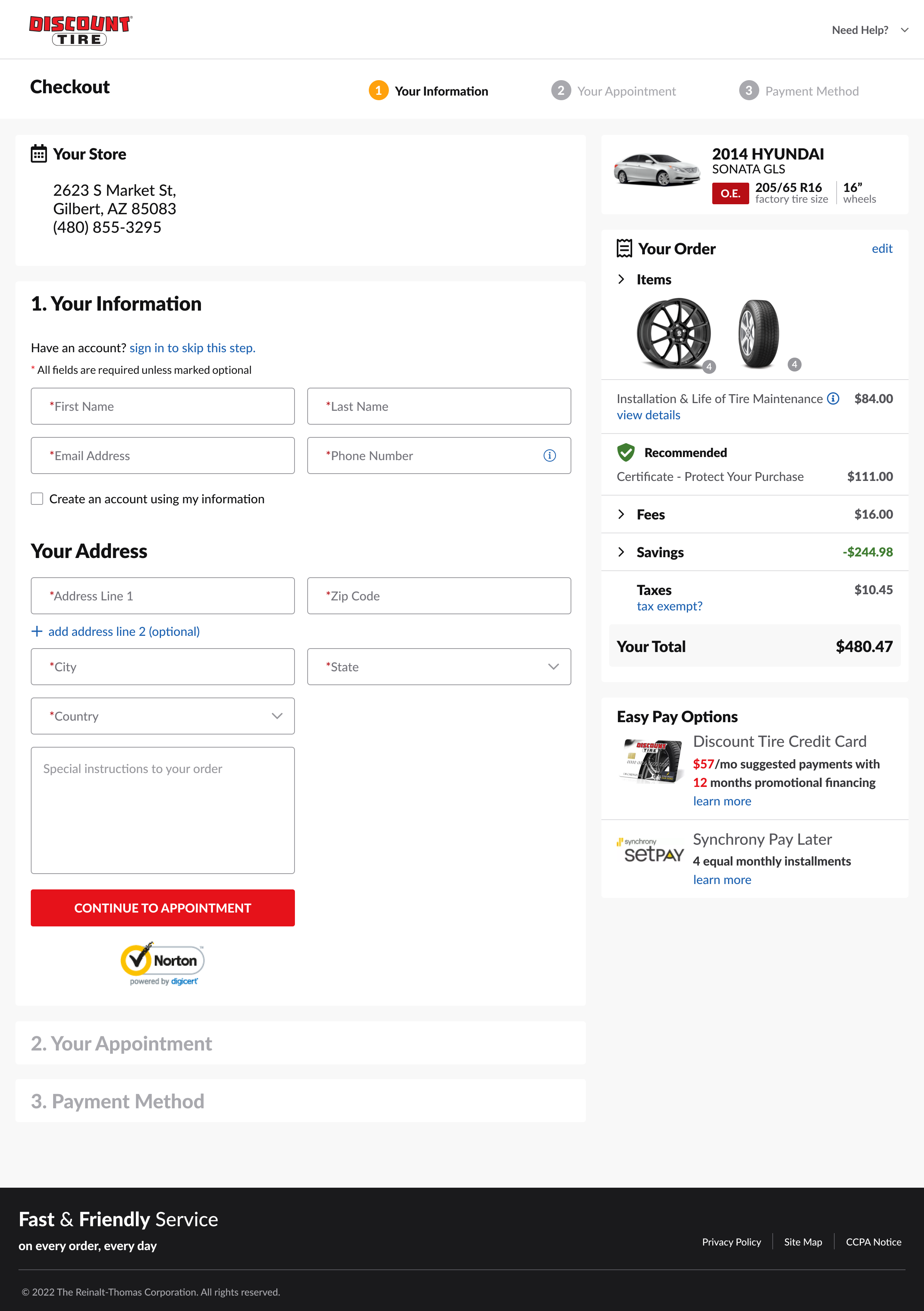
Feature 1: Sticky order summary
A sticky order summary is beneficial because it keeps the order details visible as users scroll through the checkout page. This feature offers a quick reference for the order summary and helps reduce cognitive load, making the process easier for users. Customers can easily view the total cost and any applied discounts, which can remind and encourage them to complete their purchase.

Feature 2: Enable customers to collapse/expand order summary
We designed a collapsed order summary because it enhances the checkout experience by creating a more focused, efficient, and user-friendly interface. In this design, we are reducing visual clutter, increasing focus on key actions like filling out checkout information, and allowing customers to expand the order summary if they wish to review their items, prices, and other details. Giving customers freedom and mental space in their checkout process will lead to higher satisfaction and improved conversion rates for the business.

Defending design decisions and advocating for users
Initially, these enhancements were met with some hesitation from stakeholders. One of the features they were concerned about was collapsing content within the order summary; wanting all details to be shown at once to customers. In defending the redesign of Discount Tire's checkout process, I emphasized the comprehensive user research and data-driven approach that guided the project and insights from earlier market analysis. The redesign addresses key pain points identified through user feedback, such as simplifying the checkout flow and enhancing mobile usability. By implementing a sticky and collapsed order summary, utilizing white space, and adding progress steps, we created a more intuitive and efficient experience that reduced cognitive load and increased user satisfaction.
These changes not only align with user needs but also support the business goals of increasing sales and customer loyalty. A win-win situation!
Reflections and contributions
Working with Discount Tire has been an exciting and fulfilling experience! I collaborated with a talented design team and engaged with business stakeholders to understand how design impacts the business. I presented my designs to them, worked alongside more experienced designers, and gained valuable insights into designing for e-commerce.
The iterative design process, with feedback incorporated at each stage, allowed us to refine the final product, balancing creativity and functionality. The result is a seamless and intuitive checkout experience that enhances user satisfaction and streamlines the purchasing process, demonstrating the impact of thoughtful and collaborative UX design.
Next steps
1. Implementation
This A/B test has since been designated to be an enhancement and hence would require more development work. Next steps are to iterate on designs, align cart design with two-column checkout, and implementation; integrating different components, and ensuring the product meets the initial design requirements.
2. Testing
Testing will be done to verify that the built product works correctly and meets the desired standards as outlined by business requirements earlier in the project. Here, we would test usability, conversion, and cart abandonment rates and compare results to the previous interface.
My tasks and contributions to this project include:
Designed and contributed essential components to use across point-of-sale desktop applications
Designed Order History screens with search and filtering that assists Caller Agents and their customers
Designed a Customer, Vehicle, and Store Information Dashboard to help streamline the user experience of Caller Agents and Associates
Led the Customer Vehicle Management Figma migration team in transferring and redesigning screens from Sketch to Figma. This involved providing design files and resources, establishing a workflow process, and delegating tasks to other designers on the team.
Collaborated with developers during the implementation phase to ensure that your designs were accurately realized
Attended weekly UX Design Review meetings with the broad design team and Figma Migration team to discuss project and design updates
Attended separate sprint planning sessions and provided standup updates
Designed website UX solutions based on conversion and revenue data for the A/B testing team