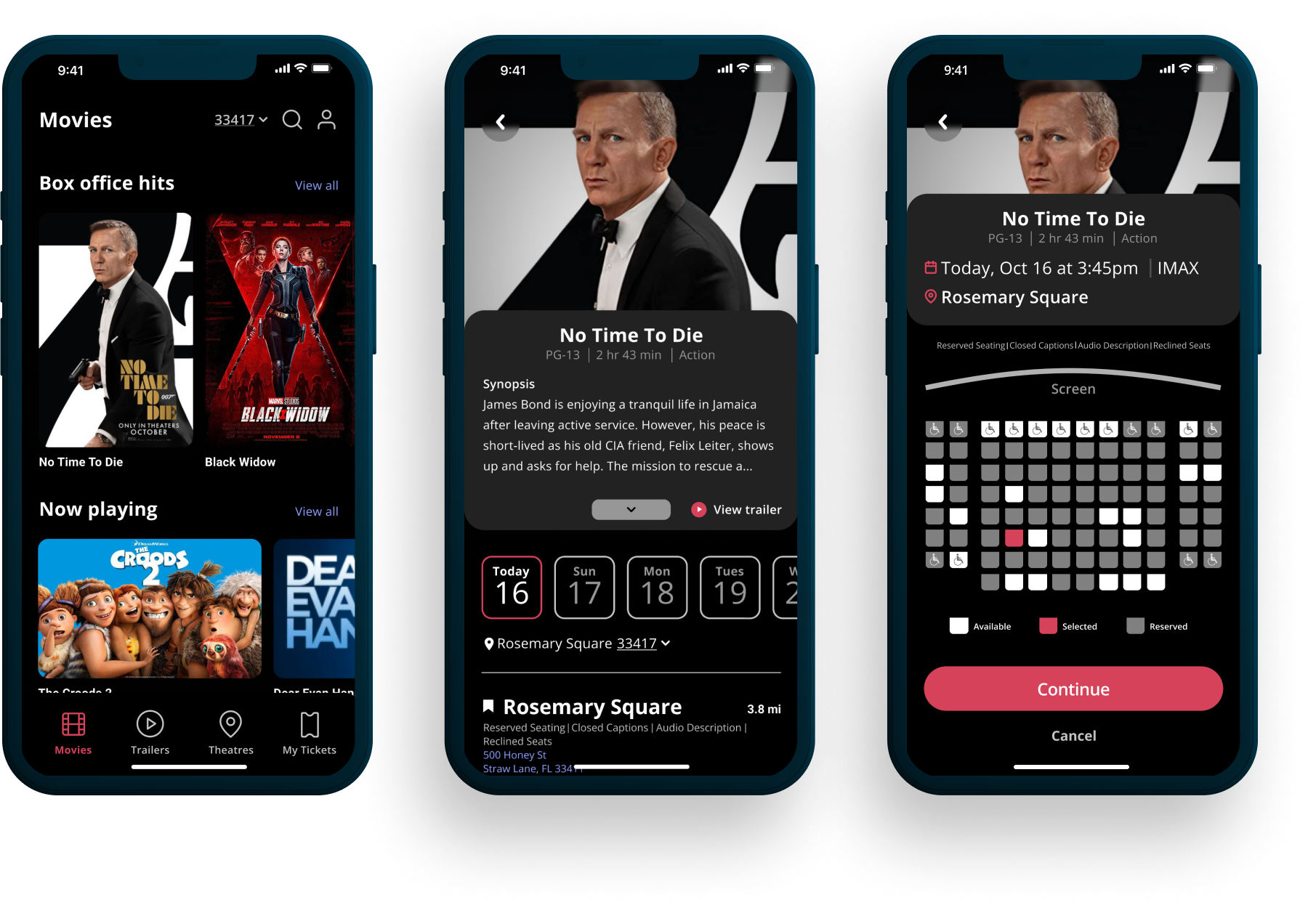
Transforming the Mobile Movie Ticket Booking Experience
The Goal
The goal is to design a movie booking app that allows customers to easily and efficiently view showtimes, select seats, and book tickets, enabling them to enter theaters without queuing.
Responsibilities
User Research & Interviews, Sketching, Wireframing, Prototyping, User Testing
Role
UX/UI Designer
Project duration
4 Months
Mobile movie booking businesses face reduced revenue and customer loyalty due to poor user experiences.
The problem
Enhance the customer’s mobile movie booking experience and ensure it’s accessible, transparent, and user-friendly.
The solution
EMPATHIZE
Research & Insights
In this project, the research I conducted includes user screening surveys, interviews, and secondary research about pre-existing movie ticketing apps. Before starting this research, I didn’t think there would be many issues to solve in regards to the movie-going experience, but after conducting user interviews and research, I came to the conclusion that the theater experience is different for everyone.
Market analysis
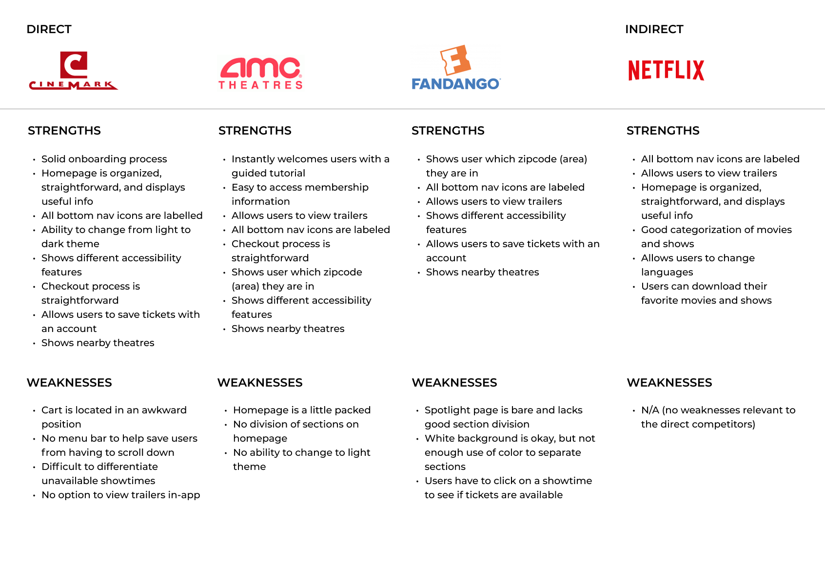
For this step, I compared the user experiences of each company’s app and website and used the research as a guideline for what satisfies customers in the market.
Conducting this analysis allowed me the opportunity to have a deeper understanding of what the market offers and why. The edge comes into play when I see their shortcomings and think to myself, "how could this be resolved?" I knew that seeing all of the competitors’ similarities could provide me the insights to make my product unique and efficient and solve the user’s problems.
My key competitors are Cinemark Theaters, AMC Theatres, and Fandango; movie theater and ticketing apps with many features, and Netflix, which is an online streaming platform. Cinemark, AMC Theatres, and Fandango are both direct competitors and Netflix is an indirect competitor.
User interviews
In order to better understand the users’ perspectives and experiences using movie ticketing apps, I recruited a total of 5 participants to conduct user interviews. For these interviews, I asked open-ended questions that allowed me to explore users’ thoughts and perspectives and focus on empathy.
Below, are a few questions that I asked the participants as well as their answers:

Insights
1. People value app organization when navigating an app, such as seating charts and price breakdowns
2. People don’t like when the correct prices aren’t reflected in a straightforward manner
3. People enjoy the benefits of having a digital ticket in order to enter theaters quickly
Needs
1. To know that they won’t have difficulty understanding information on a page
2. To see accurate prices reflected clearly
3. To have access to a digital ticket in-app
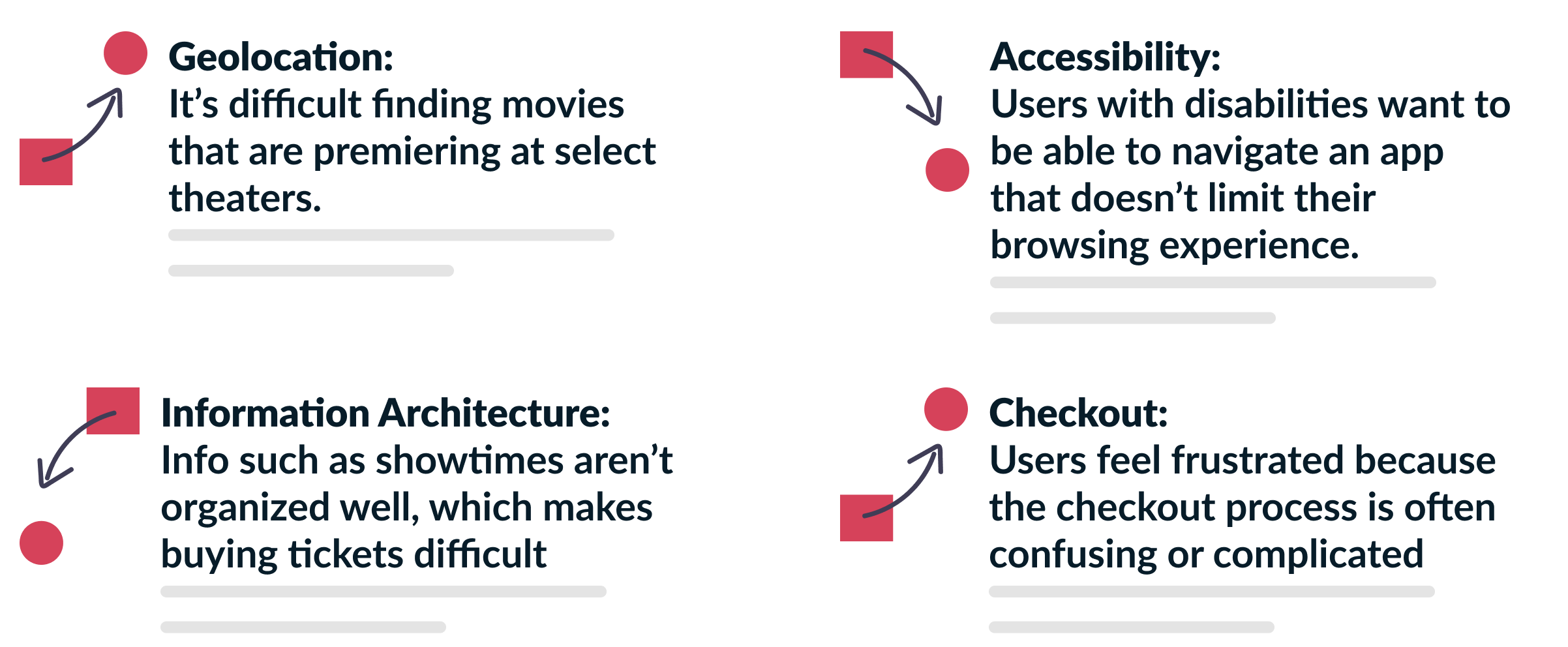
User research: Pain Points
DEFINE
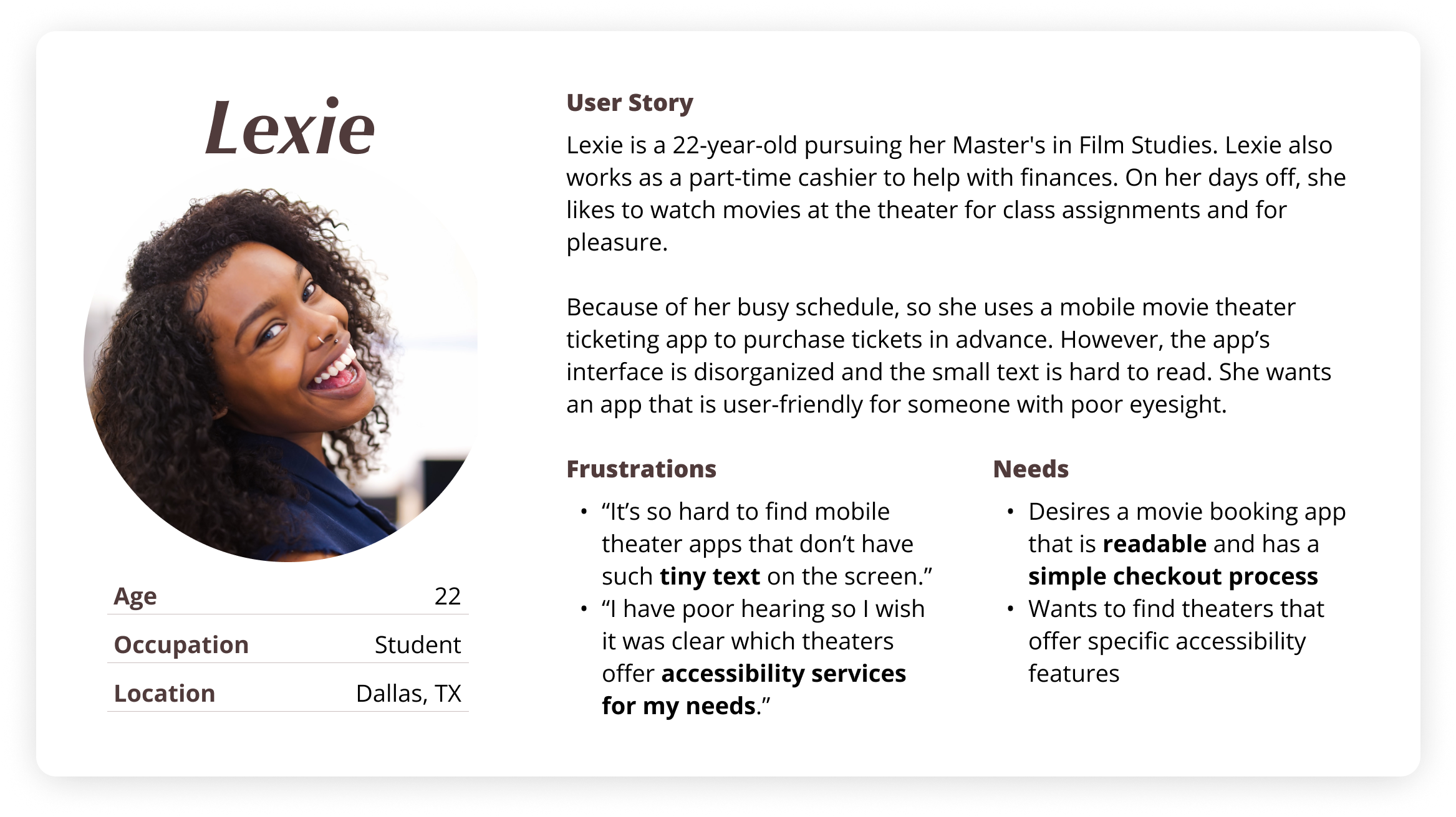
Persona development
I created these personas based on the user interviews I conducted and their frustrations with mobile booking app features. Using the research and interview results, I could further empathize with their views and pain points, adding those details to my projects’ goals.

Storyboarding the user journey
To start ideating based on my personas, I did some storyboarding to help me visualize how a user would use the product in everyday life and should navigate the app.
With the knowledge of my users in mind, the Big Picture Storyboard helped illustrate the user’s journey: their feelings, how they interact with the world, and what problems they want to be solved based on those feelings.
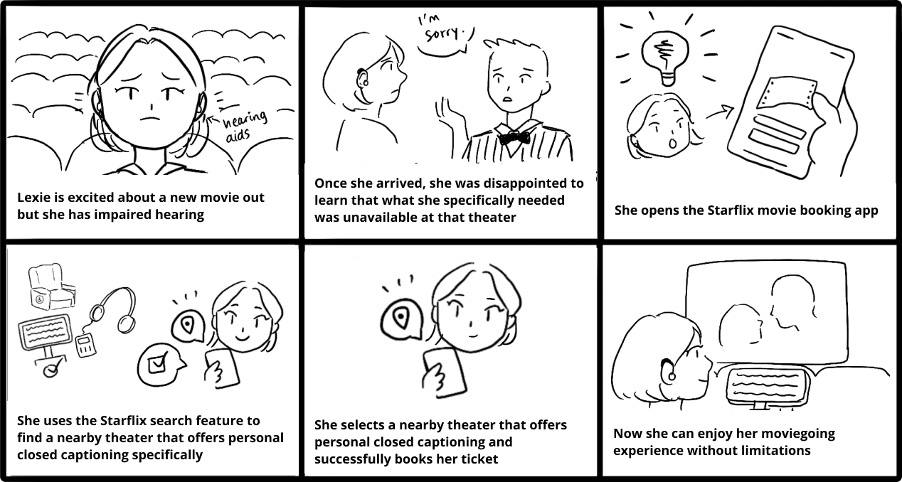
Big Picture Storyboard
Main task flow
After getting an idea of how the user will use the product, I created a task flow that represents all of the key features and screens the users will interact with. Ultimately, the goal of the user is to be able to quickly order tickets, so I used FigJam to articulate the entire process from start to finish.
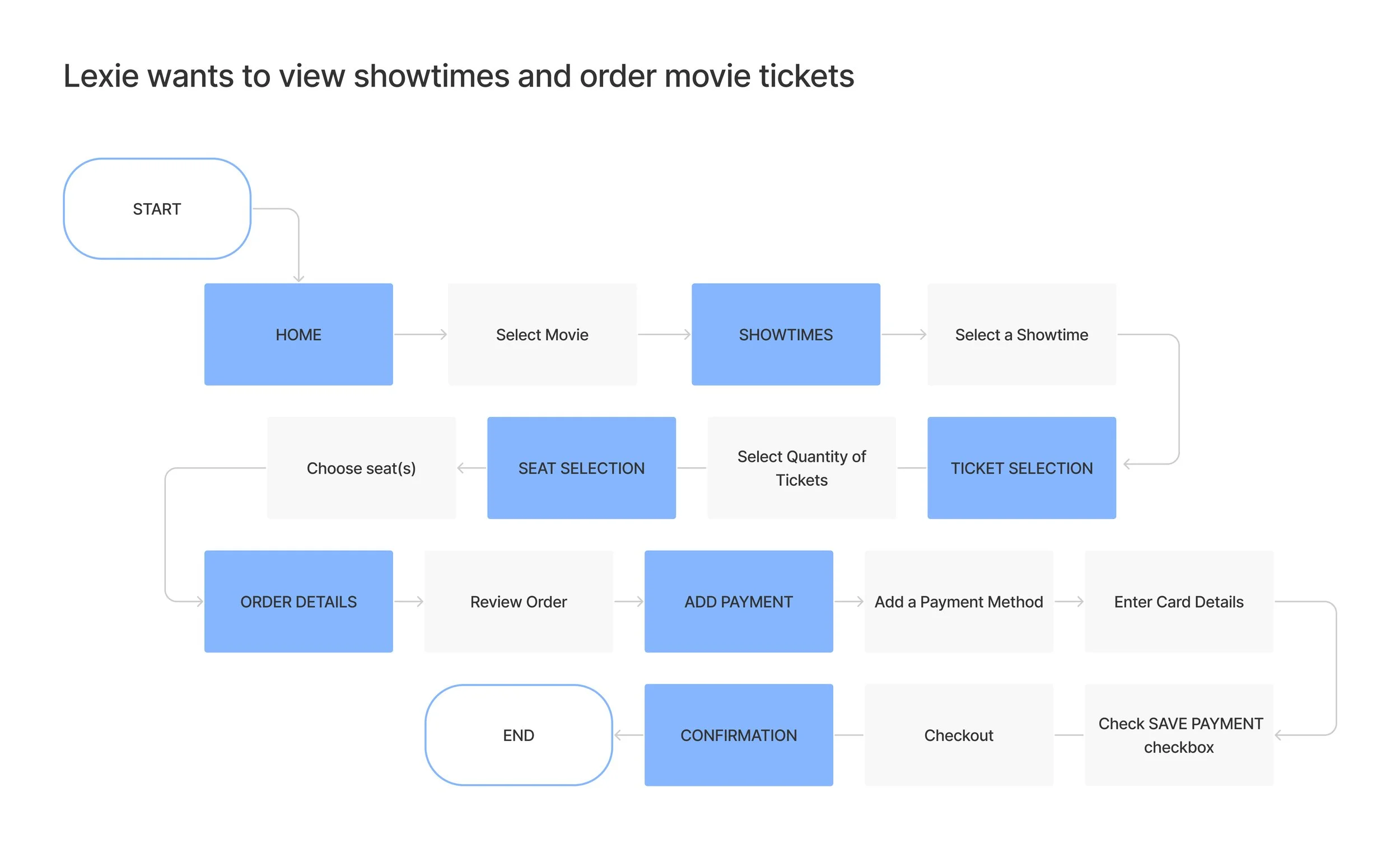
IDEATE
Design Exploration & Ideation
Sketches
During this stage, I had the challenge of figuring out the best way to lay out the home page so that users can navigate easily. First, I rapidly sketched a few layout options that would best suit the content of the app and who it is being designed for. This portion of the ideation process was very important because it saved me time by sketching some ideas down instead of skipping the sketches and then feeling stuck during wireframing.

Initial concept sketches
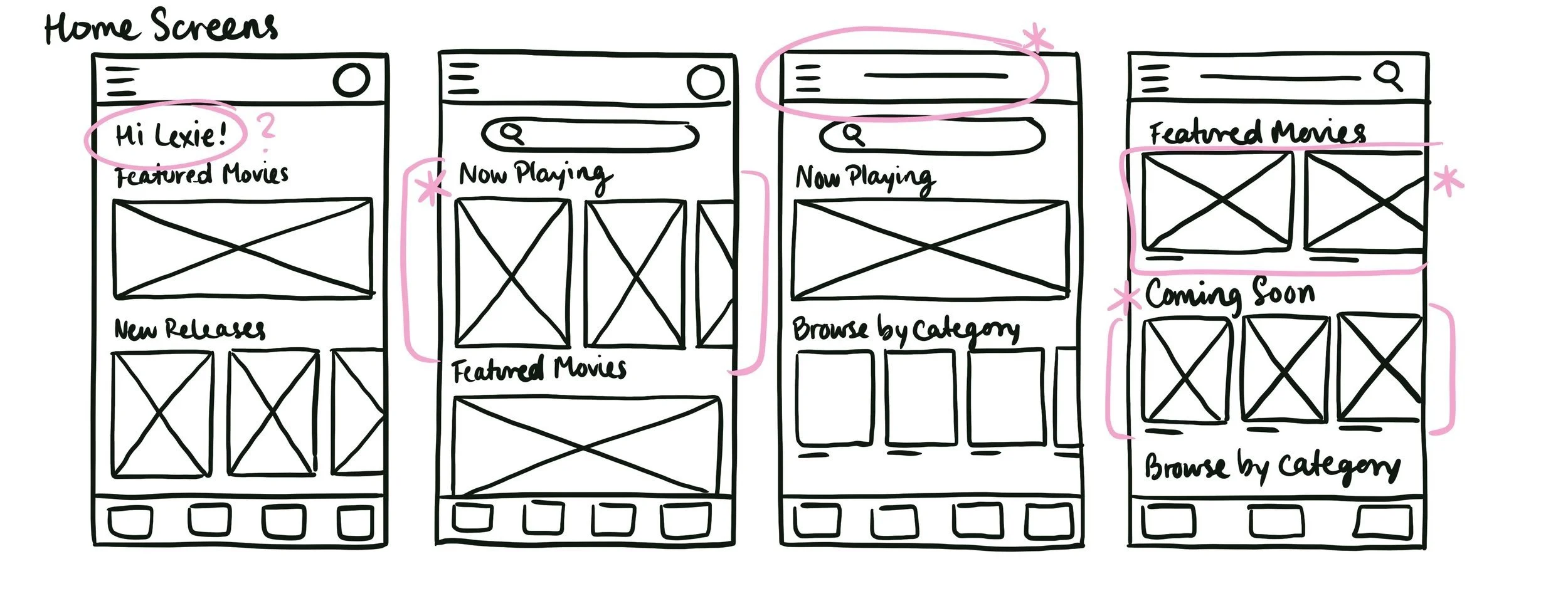
Finalizing interface choices for the homepage
PROTOTYPE & TESTING
Sketches to Wireframes
After sketching out general ideas, low-fidelity wireframing came more easily. Below, are each of the key screens that a customer will interact with based on the user flow; from Home to Checkout and Confirmation.
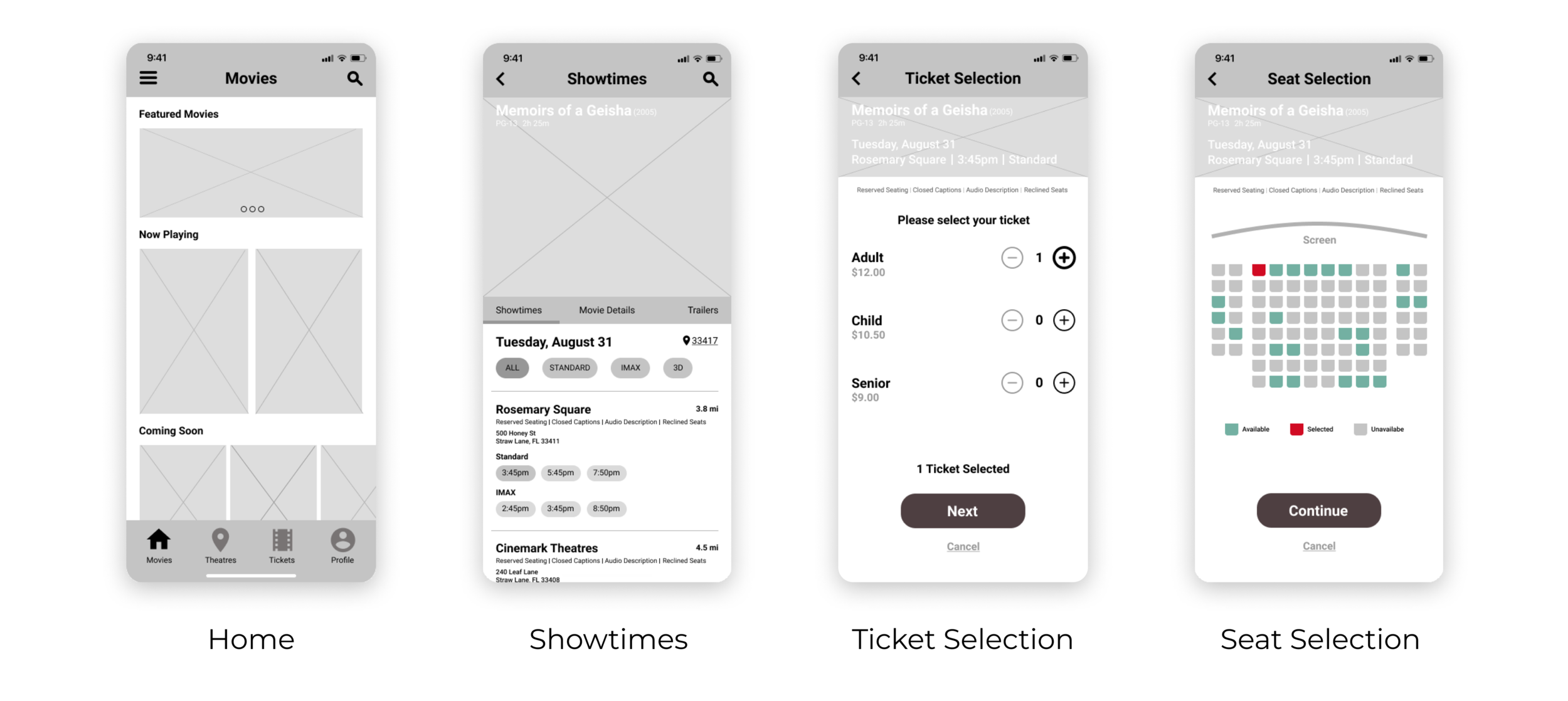
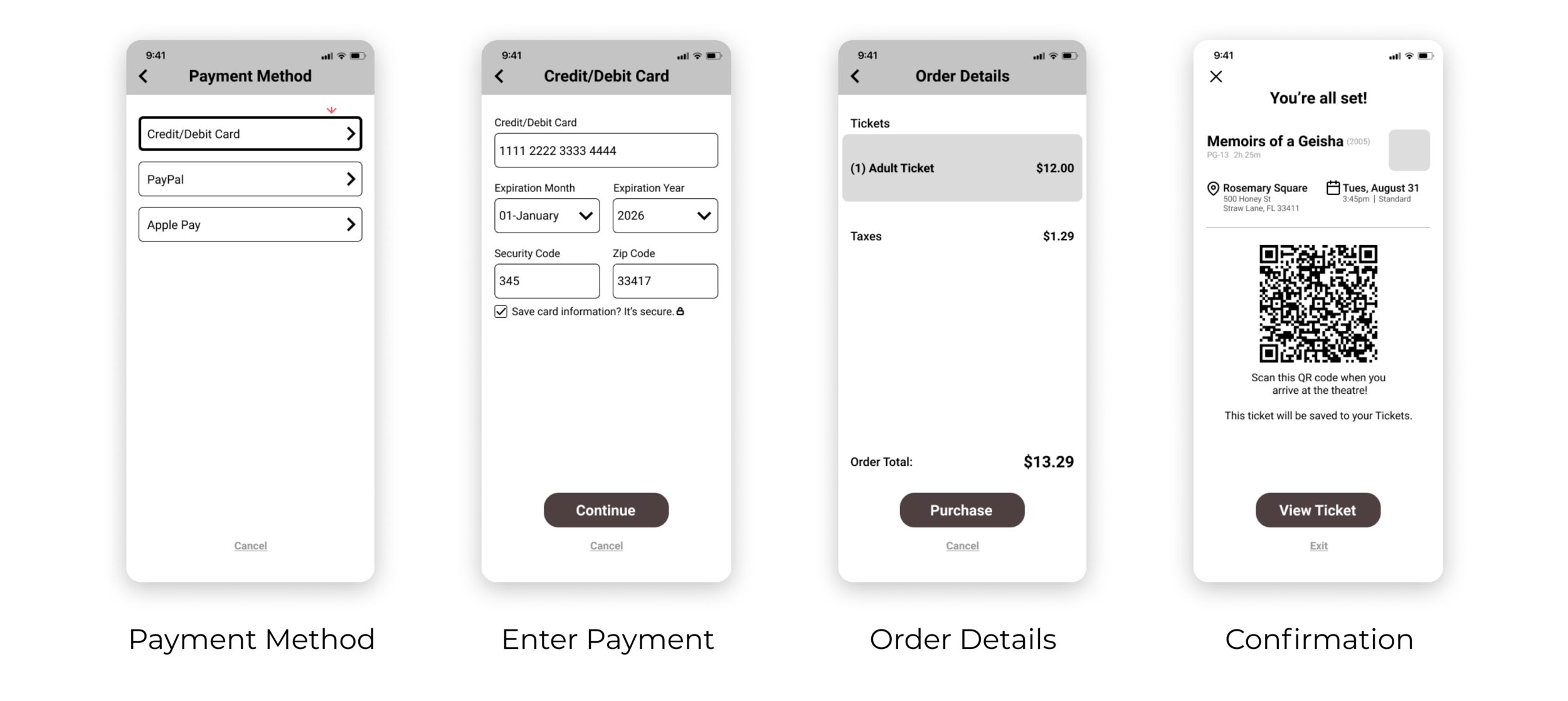
Once I finished the digital wireframes, I began prototyping when I was satisfied with the structure of each page.
Usability Testing
For usability testing, I recruited a few participants to test my designs. Most tests were remote and a couple were in-person based on location and convenience, with various ages and backgrounds.
For the remote tests, I conducted each test on video platforms such as Google Meet and Facetime.
Affinity mapping the results
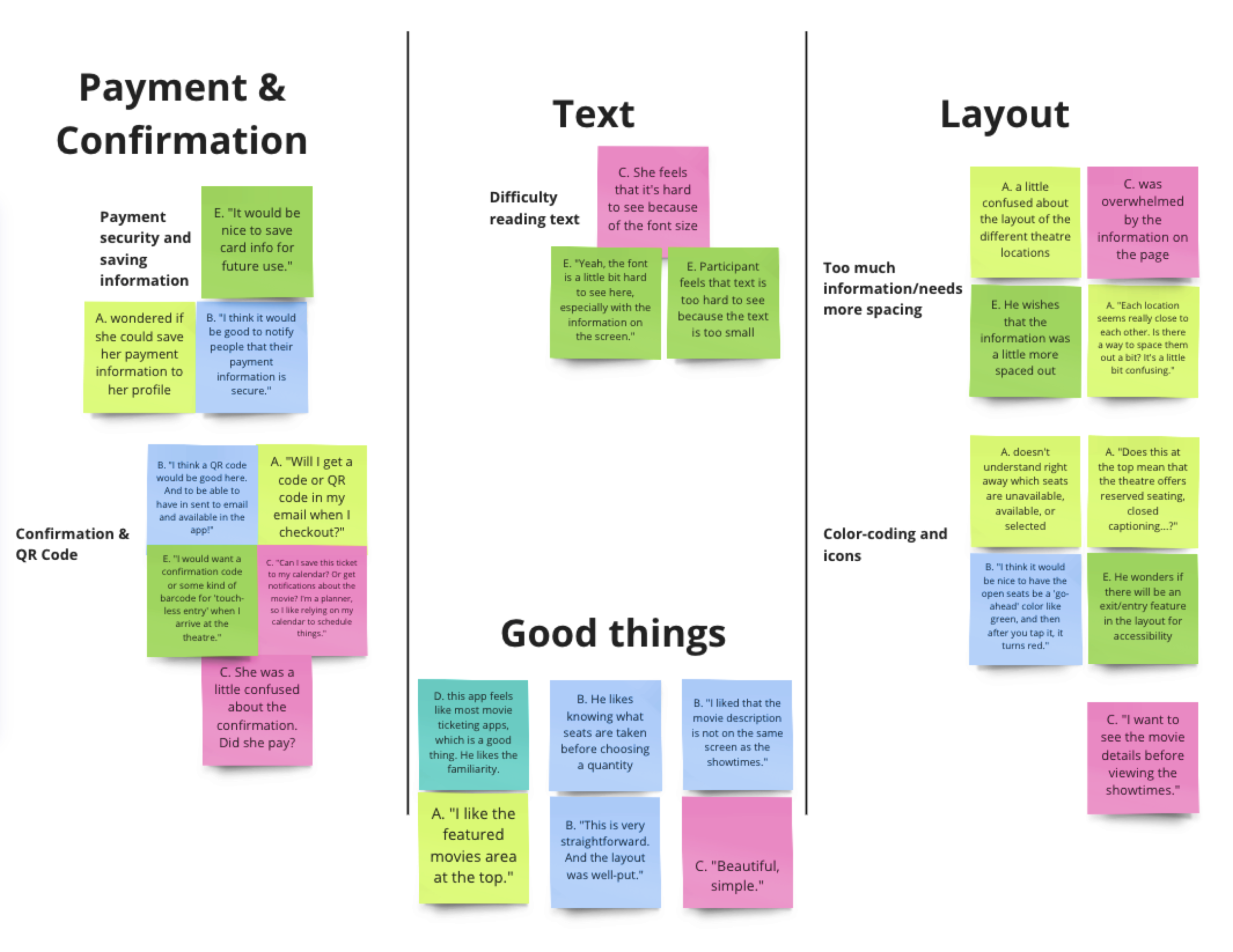
After testing, in order to synthesize my findings, I used Google Sheets to take observational notes and quotes. Next, I used Miro to begin affinity mapping to organize and understand where my low-fidelity designs failed or succeeded. Based on those findings, I was able to find themes and insights related to how users performed each task.
Methodology
Hybrid In-person and remote testing
5 Participants
Test Duration: 20-30 minutes long
Key Performance Indicators (KPIs): System Usability Scale, Time on Task
Participant Requirements
Age Range: 18-40
Those who often order tickets online or through an app
People who go to the movies at least once/twice a month (pre-Covid)
Insights
1. Users need a more organized layout with an appropriate text size so that they can find and understand information efficiently
2. Users want a seating chart that is color-coded well so that they can understand the actions that they are taking when reserving seats
3. Users need a way to securely store card information in their profile within the app so that they can quickly make purchases
4. Users desire a visible confirmation and digital ticket that can be emailed to them or available in-app so that they can have a ticket ready to show when they arrive at the theatre
Recommendations
1. Space out each theatre location and showtimes, and add more padding and lines to help separate each location for easier reading
2. Change the colors of the seating chart to help users differentiate the seat categories (color contrast)
3. Implement the option for users to opt-in for saving their preferred payment method
4. Rearrange the information to show the most important information at the top and include the QR code underneath for easy access
Design iterations
After testing, in order to synthesize my findings, I used Google Sheets to take observational notes and quotes. Next, I used Miro for affinity mapping to organize and understand where my low-fidelity designs failed or succeeded. Based on those findings, I was able to find themes and insights related to how users performed each task.
1. Space out each theatre location and showtimes, add more padding and lines to help separate each location for easier reading
2. Change the colors of the seat chart to help users differentiate the seat categories
3. Implement the option for users to opt-in for saving their preferred payment method
4. Rearrange the information to show the most-important information at the top and included the QR code underneath for easy access
High-fidelity mockups
Based on user pain points and testing feedback, I designed an intuitive booking flow where users can select seats directly from the interactive theater layout with a higher contrast combination of colors. This feature addresses the common frustration of blind seat selection and enhances the user’s confidence in their choices. The result brought forth a smoother, more enjoyable booking experience.
High-fidelity prototype
Functional design solutions
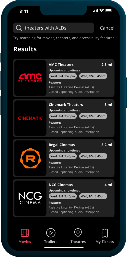
Solution 1: Add a search bar for theaters/showtimes that offer specific accessibility features
Solution 2: Display dynamic pricing before checkout for transparency

Design system
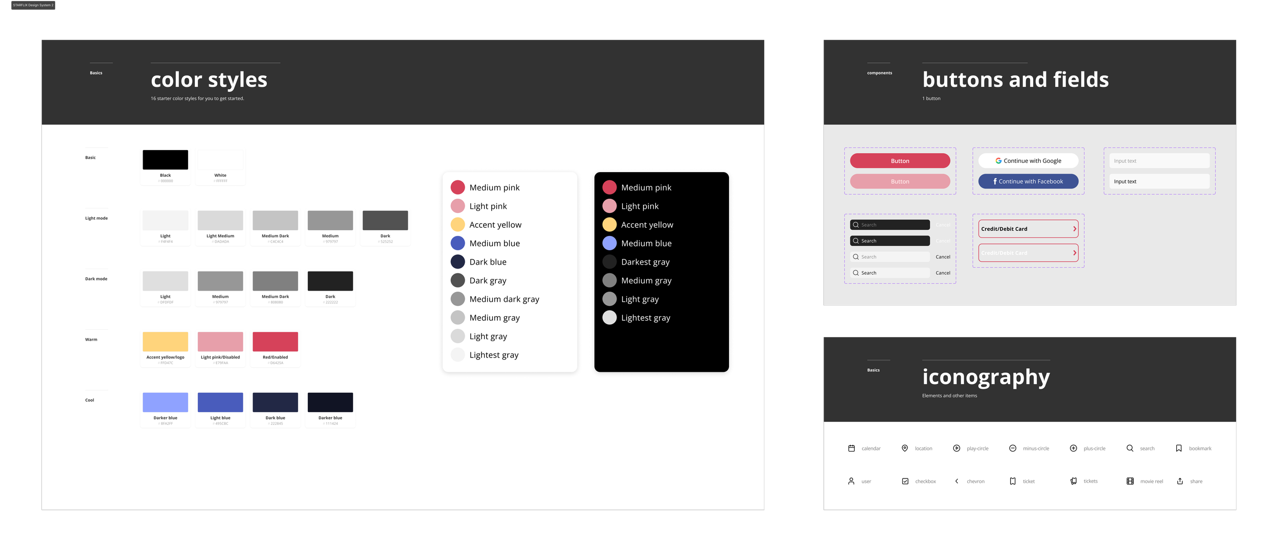
I created a small design system to maintain a consistent brand identity using components, color, iconography, and more. Because this is a movie ticketing app, I knew it needed to draw the user's attention, be pleasing to the eye, and most importantly, help guide the user flow from start to finish.
I had some challenges mainly choosing a primary color for the color palette because I wanted the brand color palette to be exciting and energizing, and not too pink (my favorite color) much like how it feels when going to the movies. I also didn’t want this product to imitate other cinema apps on the market in a choice of color. Thus, I experimented with several colors and finally decided on a "Paradise Pink" that blended well with the designs and felt energizing.
Reflection & next steps
Overall, I had fun creating this product. I’ve always loved going to the movies, especially as a film major and enthusiast but this has given me new insights into how we experience the movie-going experience. And a movie ticketing app can make or break that experience sometimes.
There were some new and interesting challenges experienced during this project. I learned about the experiences that customers have while using ticketing apps, understood the reasons why movie businesses are successful with the help of good design and thorough research, and kept my personal movie-going experiences separate from the user experiences to remain user-centered throughout the project.
What would I do differently?
Conduct more testing to gather more feedback. Even though testing was done for this project, my next steps are to take it even further and do another round because it always helps to get as much feedback as possible before finalizing a product. During this project, I was reminded that the best answers come from the users because they are at the center of everything we design. Insights based on the feedback that I received helped guide me and gave me the confidence to conduct this project despite the worries of not designing a movie ticketing app properly.
What’s next?
1. Design
Incorporate deeper user flows and interactions such as using third-party payment options
Add genre pills on the homepage to allow users to filter movies, thus reducing clicks
2. Testing & Implementation
Perform usability tests with a larger group of users
Based on new insights from another round of testing, I would then implement them before handing the finished designs to developers. Once the product launches, I would measure its performance using KPIs such as Time-on-Task and a System Usability Scale.


